

The concept is:
The longer the line segment, the thicker the calligraphy stroke should be;
the shorter the line segment, the thinner the calligraphy stroke should be.
This tutorial video shows how.
Not only for logo icons or symbols, but here is how to apply the same concept or technique to a custom-made handwriting or signature wordmark logo:
Here is one of the logos for sale at my store that uses this principle (Calligraphy Horse and Monarch Butterfly)
https://morabira.net/b/caligraphy-brush-horse-monarch-butterfly-logo

Here is another logo using this principle, also available for sale at my store (Letter S Rabbit Logo):

Kind Regards,
Morabira
Exclusive Original Premade Logo & Good Original Demo Songs for SALE!
Unique Fonts or Typography Design
Test drive or grab these fonts I designed here!
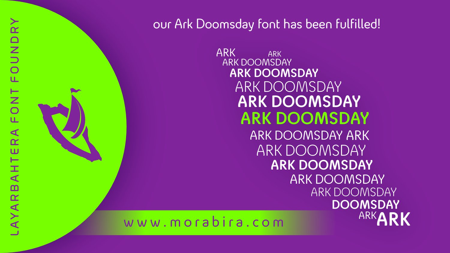
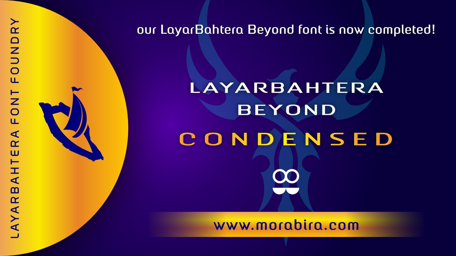
Test drive or grab these fonts I designed here!
Comments ()